Analysis using R to visualize taxi pickup locations in New York that resulted in the highest tip amount from passengers during morning rush hours
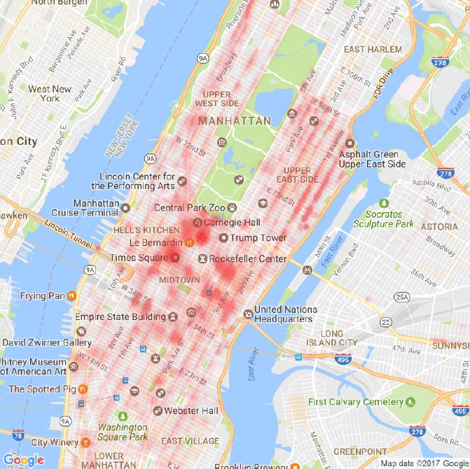
I analyzed taxi pickup locations in New York that resulted in the highest tip amount from passengers during morning rush hours (7am to 9 am) in Jan 2016. This map visualization will be useful for taxi drivers to know where to pick up passengers during those hours to maximize their earnings.
Data
I used the New York City TLC (Taxi and Limousine Commission) Trip Record Data from http://www.nyc.gov/html/tlc/html/about/trip_record_data.shtml. As the dataset for each month is large (millions of rows, in gigabytes), I only downloaded and analyzed the data for Jan 2016 Yellow at https://s3.amazonaws.com/nyc-tlc/trip+data/yellow_tripdata_2016-01.csv (1.59GB)
R Script
# Author: KS Lee (aisklogy)
# Objective: Figure out where in New York City to pick up passengers who will give the most tips during morning rush hour
# Taxi trip records by NYC Taxi and Limousine Commission (TLC)
# Website: http://www.nyc.gov/html/tlc/html/about/trip_record_data.shtml
# Direct link to dataset: https://s3.amazonaws.com/nyc-tlc/trip+data/yellow_tripdata_2016-01.csv
# What the columns in this dataset means: http://www.nyc.gov/html/tlc/downloads/pdf/data_dictionary_trip_records_yellow.pdf
# ====================================
# ====================================
# library that provides the hour() function to easily extract the hour of a given character timestamp
install.packages("lubridate")
# library that provides map plotting functionalities
install.packages("ggmap")
# library for winsorize function
install.packages("robustHD")
# ====================================
# ====================================
df = read.csv("yellow_tripdata_2016-01.csv")
print(paste("There are", dim(df)[1], "rows in the dataset")) #10,906,858
# ====================================
# ====================================
# extract rows with pickup time that is within morning rush hour (my definition: 7-9am)
df_rushhour = df[hour(df$tpep_pickup_datetime) >= 7 & hour(df$tpep_pickup_datetime) < 9, c("tpep_pickup_datetime", "pickup_longitude", "pickup_latitude", "tip_amount")]
# remove empty longitude/latitudes which are just invalid entries
df_rushhour = df_rushhour[df_rushhour$pickup_latitude!=0 & df_rushhour$pickup_longitude!=0,]
# remove outliers from longitude and latitude
outliers_perc = outliers / dim(df_rushhour)[1]
lat_quantile = quantile(df_rushhour$pickup_latitude, probs=c(outliers_perc, 1-outliers_perc))
long_quantile = quantile(df_rushhour$pickup_longitude, probs=c(outliers_perc, 1-outliers_perc))
df_rushhour = df_rushhour[df_rushhour$pickup_latitude >= lat_quantile[1] & df_rushhour$pickup_latitude <= lat_quantile[2] & df_rushhour$pickup_longitude >= long_quantile[1] & df_rushhour$pickup_longitude <= long_quantile[2],]
# remove negative tip amounts which do not make sense
df_rushhour = df_rushhour[df_rushhour$tip_amount>=0,]
# clamp the tip_amount to a certain max value, just so that it is easier to visualize on map
df_rushhour$tip_amount_winsorized = winsorize(df_rushhour$tip_amount, const=10)
# ====================================
# ====================================
# plot the entire lat/long range from our dataset
lon.range = range(df_rushhour$pickup_longitude)
lat.range = range(df_rushhour$pickup_latitude)
map = get_map(location=c(lon.range[1]-pad,lat.range[1]-pad,lon.range[2]+pad,lat.range[2]+pad), source="google", maptype="roadmap")
tip_norm = df_rushhour$tip_amount_winsorized/max(df_rushhour$tip_amount_winsorized)
ggmap(map, fullpage=TRUE) +
geom_point(aes(x=pickup_longitude, y=pickup_latitude), data=df_rushhour, colour="red", alpha=tip_norm*0.003, size=tip_norm*4)
# zoom into Manhattan area
latlong = geocode("Manhattan, New York")
map = get_map(location=c(lon=latlong[1,1], lat=latlong[1,2]-0.02), zoom=13, source="google", maptype="roadmap")
ggmap(map, fullpage=TRUE) +
geom_point(aes(x=pickup_longitude, y=pickup_latitude), data=df_rushhour, colour="red", alpha=tip_norm*0.007, size=tip_norm*7)
# Author: KS Lee (aisklogy)
# Date: 11 Mar 2017

# Objective: Figure out where in New York City to pick up passengers who will give the most tips during morning rush hour

# Taxi trip records by NYC Taxi and Limousine Commission (TLC)
# Website: http://www.nyc.gov/html/tlc/html/about/trip_record_data.shtml
# Direct link to dataset: https://s3.amazonaws.com/nyc-tlc/trip+data/yellow_tripdata_2016-01.csv
# What the columns in this dataset means: http://www.nyc.gov/html/tlc/downloads/pdf/data_dictionary_trip_records_yellow.pdf

# ====================================
# load libraries
# ====================================

# library that provides the hour() function to easily extract the hour of a given character timestamp
install.packages("lubridate")
library(lubridate)

# library that provides map plotting functionalities
install.packages("ggmap")
library(ggmap)

# library for winsorize function
install.packages("robustHD")
library(robustHD)

# ====================================
# load dataset
# ====================================

# load CSV file
setwd("/path/to/data")
df = read.csv("yellow_tripdata_2016-01.csv")
print(paste("There are", dim(df)[1], "rows in the dataset"))  #10,906,858

# ====================================
# prep data
# ====================================

# extract rows with pickup time that is within morning rush hour (my definition: 7-9am)
df_rushhour = df[hour(df$tpep_pickup_datetime) >= 7 & hour(df$tpep_pickup_datetime) < 9, c("tpep_pickup_datetime", "pickup_longitude", "pickup_latitude", "tip_amount")]

# remove empty longitude/latitudes which are just invalid entries
df_rushhour = df_rushhour[df_rushhour$pickup_latitude!=0 & df_rushhour$pickup_longitude!=0,]

# remove outliers from longitude and latitude
outliers = 100
outliers_perc = outliers / dim(df_rushhour)[1]
lat_quantile = quantile(df_rushhour$pickup_latitude, probs=c(outliers_perc, 1-outliers_perc))
long_quantile = quantile(df_rushhour$pickup_longitude, probs=c(outliers_perc, 1-outliers_perc))
df_rushhour = df_rushhour[df_rushhour$pickup_latitude >= lat_quantile[1] & df_rushhour$pickup_latitude <= lat_quantile[2] & df_rushhour$pickup_longitude >= long_quantile[1] & df_rushhour$pickup_longitude <= long_quantile[2],]

# remove negative tip amounts which do not make sense
df_rushhour = df_rushhour[df_rushhour$tip_amount>=0,]

# clamp the tip_amount to a certain max value, just so that it is easier to visualize on map
df_rushhour$tip_amount_winsorized = winsorize(df_rushhour$tip_amount, const=10)

# ====================================
# visualize data
# ====================================

# plot the entire lat/long range from our dataset
lon.range = range(df_rushhour$pickup_longitude)
lat.range = range(df_rushhour$pickup_latitude)
pad = 0.05
map = get_map(location=c(lon.range[1]-pad,lat.range[1]-pad,lon.range[2]+pad,lat.range[2]+pad), source="google", maptype="roadmap")
tip_norm = df_rushhour$tip_amount_winsorized/max(df_rushhour$tip_amount_winsorized)
ggmap(map, fullpage=TRUE) +
  geom_point(aes(x=pickup_longitude, y=pickup_latitude), data=df_rushhour, colour="red", alpha=tip_norm*0.003, size=tip_norm*4)

# zoom into Manhattan area
latlong = geocode("Manhattan, New York")
map = get_map(location=c(lon=latlong[1,1], lat=latlong[1,2]-0.02), zoom=13, source="google", maptype="roadmap")
ggmap(map, fullpage=TRUE) +
  geom_point(aes(x=pickup_longitude, y=pickup_latitude), data=df_rushhour, colour="red", alpha=tip_norm*0.007, size=tip_norm*7)
# Author: KS Lee (aisklogy)
# Date: 11 Mar 2017
# Objective: Figure out where in New York City to pick up passengers who will give the most tips during morning rush hour
# Taxi trip records by NYC Taxi and Limousine Commission (TLC)
# Website: http://www.nyc.gov/html/tlc/html/about/trip_record_data.shtml
# Direct link to dataset: https://s3.amazonaws.com/nyc-tlc/trip+data/yellow_tripdata_2016-01.csv
# What the columns in this dataset means: http://www.nyc.gov/html/tlc/downloads/pdf/data_dictionary_trip_records_yellow.pdf
# ====================================
# load libraries
# ====================================
# library that provides the hour() function to easily extract the hour of a given character timestamp
install.packages("lubridate")
library(lubridate)
# library that provides map plotting functionalities
install.packages("ggmap")
library(ggmap)
# library for winsorize function
install.packages("robustHD")
library(robustHD)
# ====================================
# load dataset
# ====================================
# load CSV file
setwd("/path/to/data")
df = read.csv("yellow_tripdata_2016-01.csv")
print(paste("There are", dim(df)[1], "rows in the dataset")) #10,906,858
# ====================================
# prep data
# ====================================
# extract rows with pickup time that is within morning rush hour (my definition: 7-9am)
df_rushhour = df[hour(df$tpep_pickup_datetime) >= 7 & hour(df$tpep_pickup_datetime) < 9, c("tpep_pickup_datetime", "pickup_longitude", "pickup_latitude", "tip_amount")]
# remove empty longitude/latitudes which are just invalid entries
df_rushhour = df_rushhour[df_rushhour$pickup_latitude!=0 & df_rushhour$pickup_longitude!=0,]
# remove outliers from longitude and latitude
outliers = 100
outliers_perc = outliers / dim(df_rushhour)[1]
lat_quantile = quantile(df_rushhour$pickup_latitude, probs=c(outliers_perc, 1-outliers_perc))
long_quantile = quantile(df_rushhour$pickup_longitude, probs=c(outliers_perc, 1-outliers_perc))
df_rushhour = df_rushhour[df_rushhour$pickup_latitude >= lat_quantile[1] & df_rushhour$pickup_latitude <= lat_quantile[2] & df_rushhour$pickup_longitude >= long_quantile[1] & df_rushhour$pickup_longitude <= long_quantile[2],]
# remove negative tip amounts which do not make sense
df_rushhour = df_rushhour[df_rushhour$tip_amount>=0,]
# clamp the tip_amount to a certain max value, just so that it is easier to visualize on map
df_rushhour$tip_amount_winsorized = winsorize(df_rushhour$tip_amount, const=10)
# ====================================
# visualize data
# ====================================
# plot the entire lat/long range from our dataset
lon.range = range(df_rushhour$pickup_longitude)
lat.range = range(df_rushhour$pickup_latitude)
pad = 0.05
map = get_map(location=c(lon.range[1]-pad,lat.range[1]-pad,lon.range[2]+pad,lat.range[2]+pad), source="google", maptype="roadmap")
tip_norm = df_rushhour$tip_amount_winsorized/max(df_rushhour$tip_amount_winsorized)
ggmap(map, fullpage=TRUE) +
geom_point(aes(x=pickup_longitude, y=pickup_latitude), data=df_rushhour, colour="red", alpha=tip_norm*0.003, size=tip_norm*4)
# zoom into Manhattan area
latlong = geocode("Manhattan, New York")
map = get_map(location=c(lon=latlong[1,1], lat=latlong[1,2]-0.02), zoom=13, source="google", maptype="roadmap")
ggmap(map, fullpage=TRUE) +
geom_point(aes(x=pickup_longitude, y=pickup_latitude), data=df_rushhour, colour="red", alpha=tip_norm*0.007, size=tip_norm*7)
Results
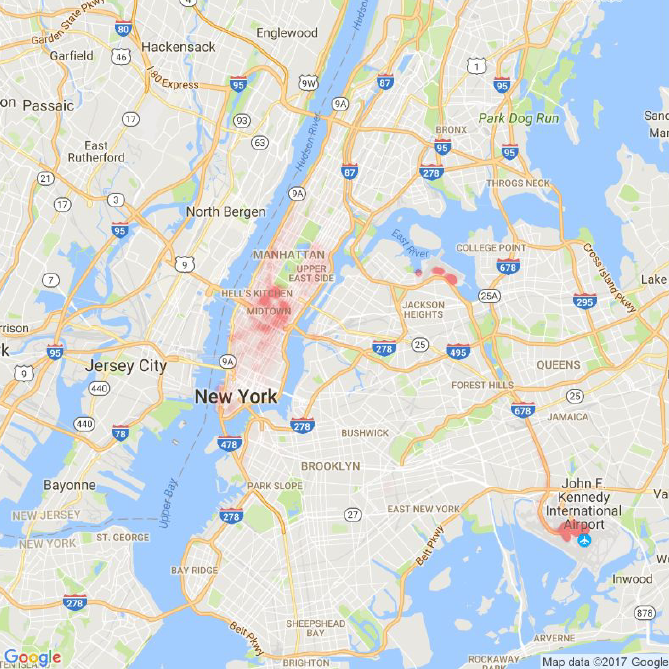
The red regions are concentrated around three regions: JFK airport, LaGuardia airport and Manhattan area directly southwest of Central Park.
I plotted another map which zooms into the Manhattan area to get a closer look at which exact areas are the hotspots: Times Square, Rockefeller Center, Museum of Modern Art area etc. These areas make sense since they are popular areas in New York.