This is a data analysis exercise on the diamonds dataset in ggplot2 using R.
Distributions of color, carat and price
Firstly, let’s do a quick analysis at the available data and get a general sense of the distributions of color, carat and price.
library(ggplot2)
data(diamonds)
| carat | color | price |
|---|---|---|
| 0.23 | E | 326 |
| 0.21 | E | 326 |
| 0.23 | E | 327 |
| 0.29 | I | 334 |
| 0.31 | J | 335 |
| 0.24 | J | 336 |
| 0.24 | I | 336 |
| 0.26 | H | 337 |
| 0.22 | E | 337 |
| … | … | … |
showing only first 10 rows and only the carat/color/price columns
Color
# bar chart of color
ggplot(diamonds, aes(x=color)) +
  geom_histogram(stat='count') +
  ggtitle("bar chart of color") +
  theme(plot.title = element_text(hjust = 0.5))
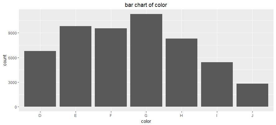
- Unimodal distribution
- Approximately symmetrical with a slight skew to the right
- Most diamonds are of G color grade, around 11000 of them
- Least diamonds are of J color grade, around 2800 of them
Carat
# histogram of carat
ggplot(diamonds, aes(x=carat)) +
  geom_histogram(binwidth=0.5) +
  ggtitle("histogram of carat (bin width 0.5)") +
  theme(plot.title = element_text(hjust = 0.5))
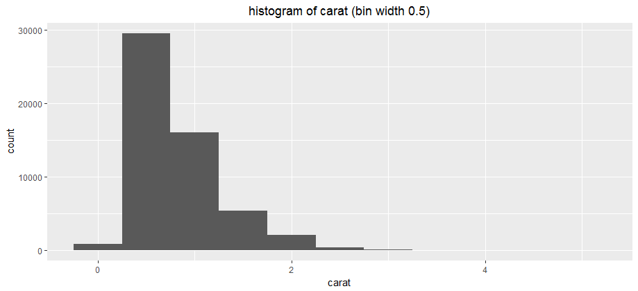
- Unimodal distribution
- Non-symmetrical, skewed to the right, with a long right tail. This makes sense because diamonds with high carats are less common.
- The data sample contains mostly diamonds in the [0.25, 0.75] carat bin
- The mode is about 2 times the height of the next highest bin
Price
# histogram of price
ggplot(diamonds, aes(x=price)) +
  geom_histogram(binwidth=1000) +
  ggtitle("histogram of price (bin width 1000)") +
  theme(plot.title = element_text(hjust = 0.5))
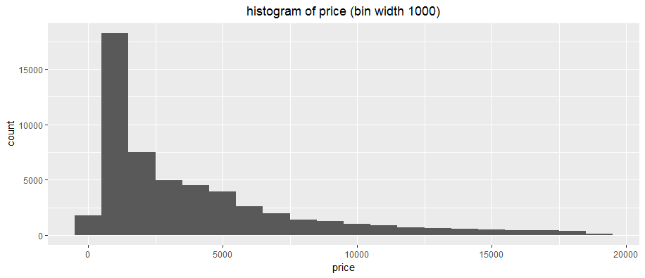
- Unimodal distribution
- Non-symmetrical, skewed to the right, with a long right tail
- The data sample contains mostly diamonds in the [$500, $1500] bin, around 18000 of them
- The mode is about 2.5 times the height of the next highest bin
Relationship between price, carat and color
Next, I analyzed the three-way relationship between price, carat and color.
# facet of price vs carat for each color
qplot(x=carat, y=price, data=diamonds, facets=.~color, size=I(0.2), col=I('red'), main='facet of price vs carat for each color') +
  theme(plot.title = element_text(hjust = 0.5))
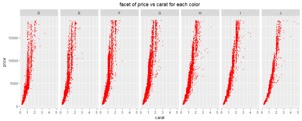
From the graphs, price increases as carat increases, in general.
The plots also shift slowly to the right as color grade increases. This can be analyzed in two ways:
- For higher letter color grades (e.g. J), it takes a higher carat value to reach the same price as other color grades. For example, the J color plot shows that it needs about 2 carat to reach the maximum price, while the D color plots shows that it needs only about 1 carat to reach the maximum price. This means that lower letter color grades (e.g. D) have higher price value than higher color grades (e.g. J).
- For a particular carat, lower color grade (e.g. D) fetches higher prices. For example, for 1 carat, a color grade of D can fetch around $2500-$18000 but a color grade of J can only fetch around $2500-$5000.
All these mean that lower letter color grades and higher carats fetch higher prices.
# scatter plot of price vs carat
plot(diamonds$carat, diamonds$price, pch=18, col=2, cex=0.5, xlab='carat', ylab='price', main='scatter plot of price vs carat')
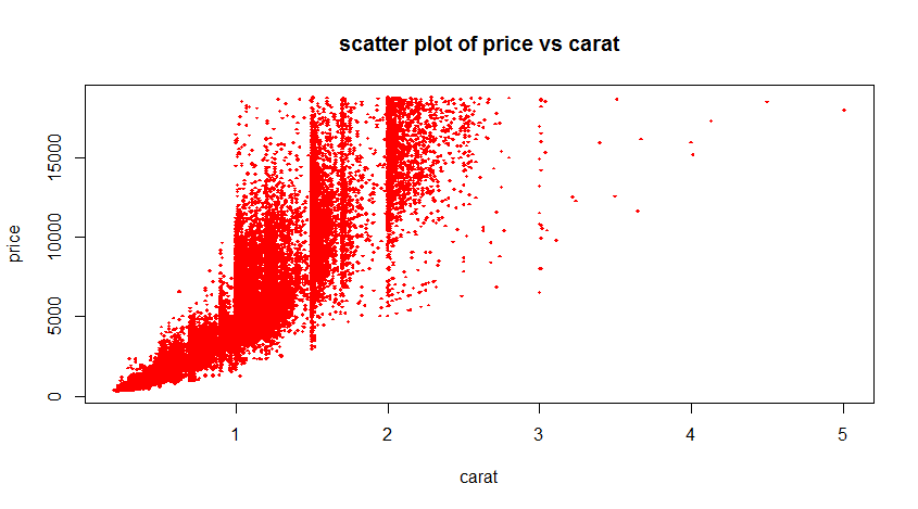
We now know that higher carats fetch higher prices, but a large portion of the diamonds are fetching high prices even at low carats. For example, there are a number of 1-carat diamonds fetching high prices, comparable to the prices of 3-, 4- and 5-carat diamonds. This might mean there are factors other than carats which drives up the prices, such as color.
# box plot of price for each color
plot(diamonds$color, diamonds$price, pch=18, col=2, cex=0.5, xlab='color', ylab='price', main='box plot of price for each color')
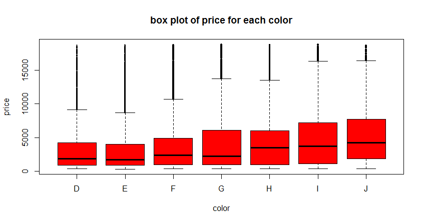
The box plot above shows that the distribution of prices for color D is much lower (it has a lower mean and interquartile range). This does not make sense because from the plots above, color grade D is suppose to fetch higher prices so the mean price should be higher.
# box plot of carat for each color
plot(diamonds$color, diamonds$carat, pch=18, col=2, cex=0.75, xlab='color', ylab='carat', main='box plot of carat for each color')
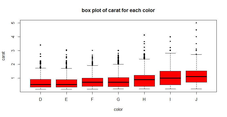
This plot explains the observation: it shows that for D color grade, the data sample contains mostly of low carats. For higher color grades, the data sample contains higher carats. This could be because D color grade diamonds are high quality and rare, and the dataset is unable to provide enough data to show the true distribution.
The conclusion is that high carats and low color grades fetch high prices. However, the data sample does not contain enough high carat low color grade samples to show the maximum potential of this combination.